Months after listening I am still thinking about this interview with Kenneth Frampton. I’ve never heard him mention disability, but I think like it contains all the pieces needed to move from an architecture that merely comes from blindness to a politicized blind architecture.
This week’s notes on the conceptual framwork for the house
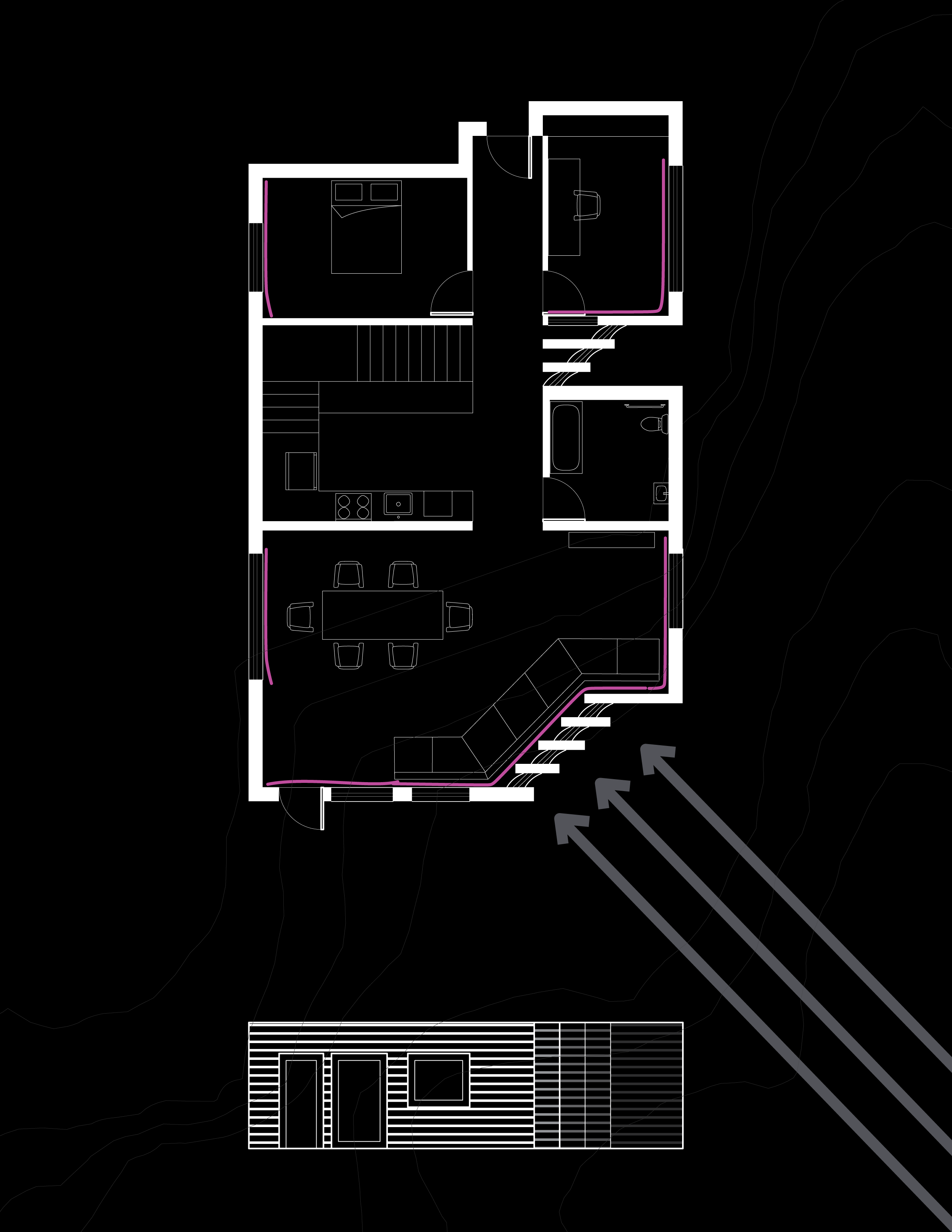
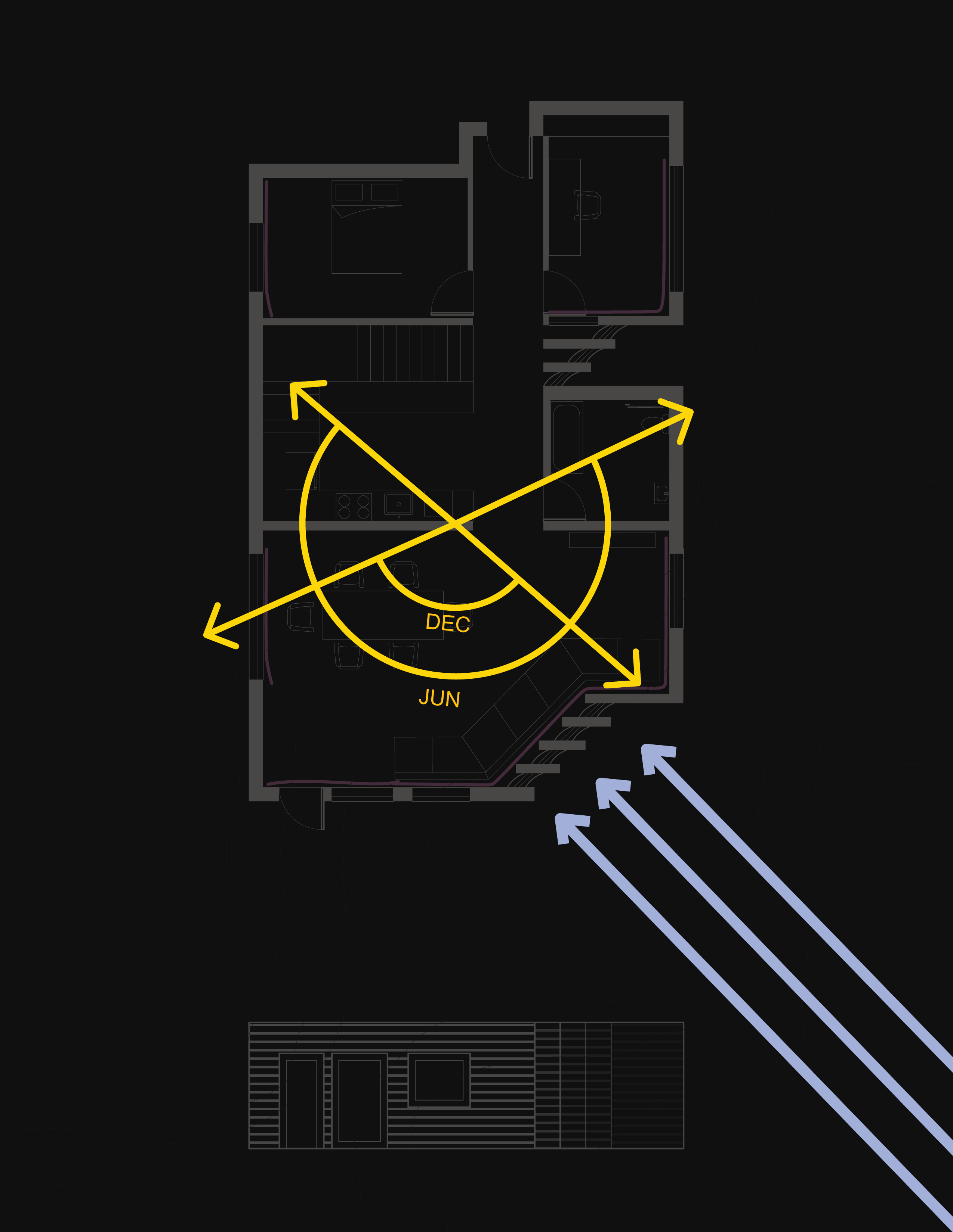
Charlotte’s two drawings for a house at Perkins. Still some guts and service missing and some changes coming but we are very feeling a lot of excitement and momentum, which is great. So appreciate her as a collaborator :-)
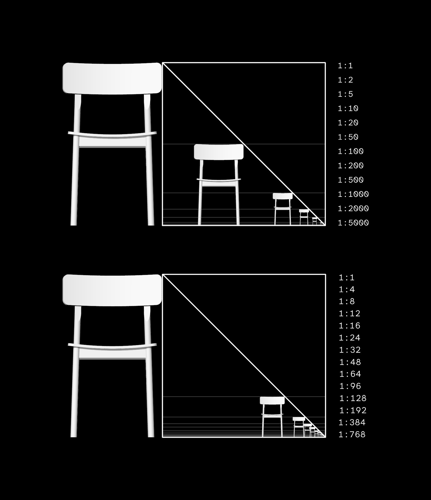
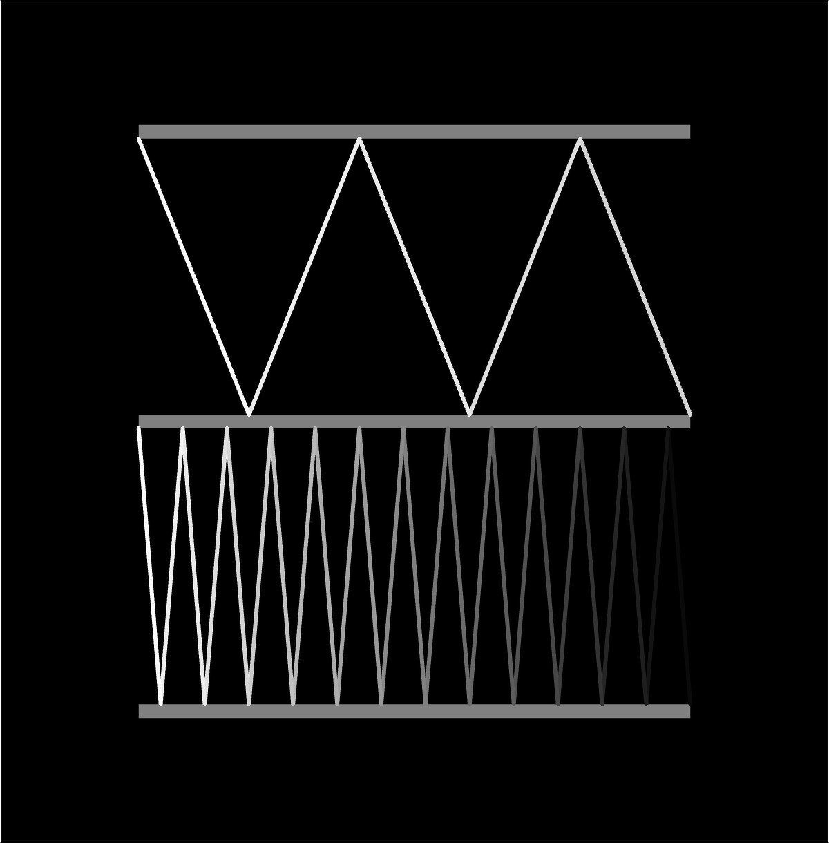
Quick diagram of metric (top) vs. imperial (bottom) standard architectural scales. Was interested in understanding how these scales are determined in order to develop an architectural scale set for tactile plans, which in my experience need to be much bigger to be legible with the same level of detail.
Old drawing from 2016, and some notes on it
I’m still so obsessed with the synthetic speech and gregorian chant in Toshi Ishiyanagi’s Music for Living Space, and its implications for the artful use of screen readers and synthetic speech.
A list of a few things that I’ve been interested in recently.
- Met Marco Salsiccia and found his BlindSVG generator and lots of other cool materials on his website
- Andrew Stone showed me KnowHow Shop’s ceramics studio for the blind ceramicist Don Katz, which used 1:1 prototypes of construction details as the primary design method
- In that vein, I enjoyed Abraham Cruz Villegas Art21 short on Autoconstrucción, a direct construction practice based on self-built architecture in Mexico City
- One of my favorite artists, Lenka Clayton, was in the recent Human Nature episode of Art21
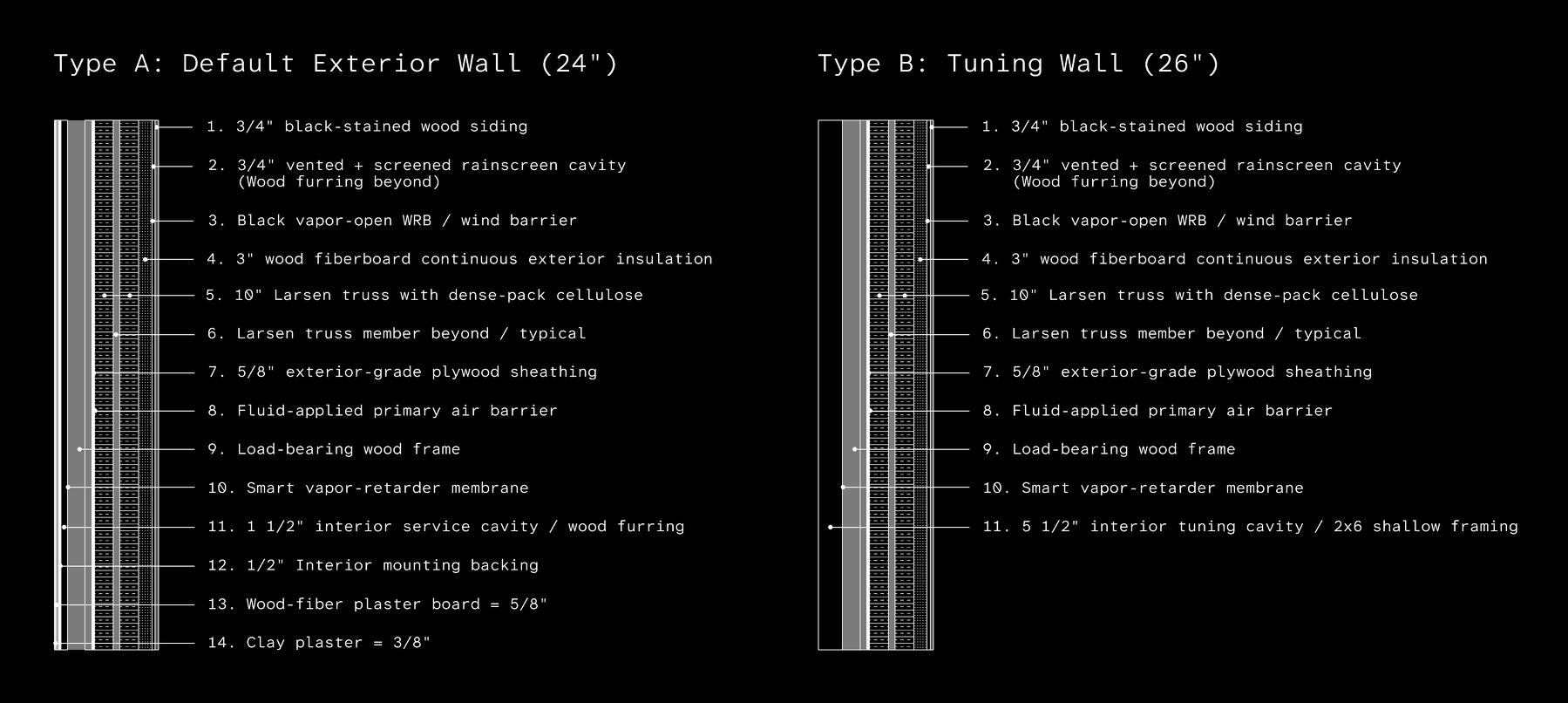
- Have been designing wall sections for the hosue at Perkins, and thus revisiting Andrea Deplazes
- Some of the work of Rael San Fratello has some tactile interest
- Have loved picking through the reading list on Life, Nature, Time, Community & Happiness at the end of Samin Nosrat’s cookbook Good Things, and oppositely, have just started Misery Meals
- A conversation with Lavendar Darcangelo has me revisiting plain language, and thinking about the tension in Crip Authorship between Mel Y. Chen’s “to hell with accessible writing” piece and Kelsey Acton’s plain language manifesto
- Blood in the Machine by Brian Merchant has been interesting
- Have almost finished Paul Fry’s open course on Literary Theory. It’s almost fifteen years old, but the final four lectures have been immensely helpful in grounding some ambivalence I’ve been feeling around disability as identity
Have also divested from a few things:
- Have replaced google search with Kagi (weird politics, horrible accessibility backslide, and nonconsensual AI is getting to be too much.) You’re next GMail!
- Also shifting out of Adobe into free and open source programs like GIMP, Krita, and Typest.
- Still love Rhino, and vibe-coding actually lets me bypass huge parts of the visual interface, have been talking with their developer team about making it more blind-friendly. May be pretty close to a totally nonvisual 3D modeling workflow there.
- I’m waiting for the Microsoft divestments to feel possible. Maybe I should just jump ship and start using EMacSpeak? The surveillance technology in Gaza is sickening.
- Have not boycotted OpenAI, like everyone else in academia seems to be doing these days, but there’s definitely a lot of ambivalence there. More in this in the future.
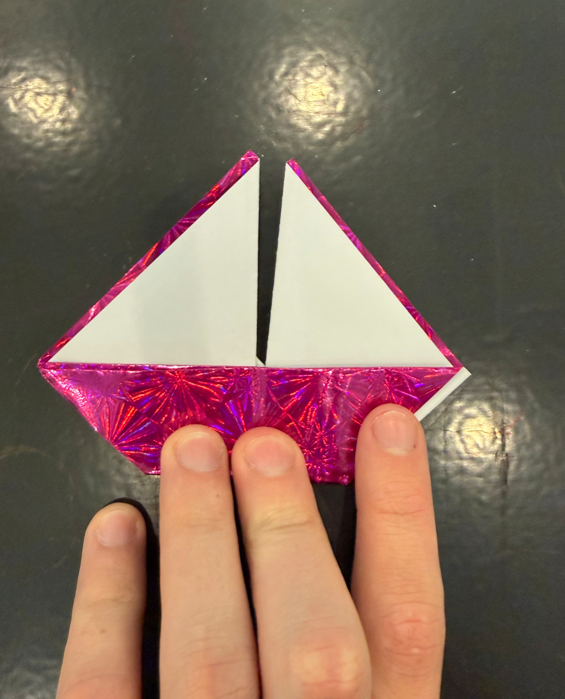
Origami sailboat from a blindfolded origami workshop. My table neighbor said the backside of the paper felt shiny. To me it also felt waxy, like there was sealant on the boat, vs the rough papery sails.
As a blind designer, I don’t always feel that there is a clear and direct relationship between tools that provide blind access to design (i.e. tactile drawing) and better buidling for blind people. I wrong about negotiating that in this journal entry.
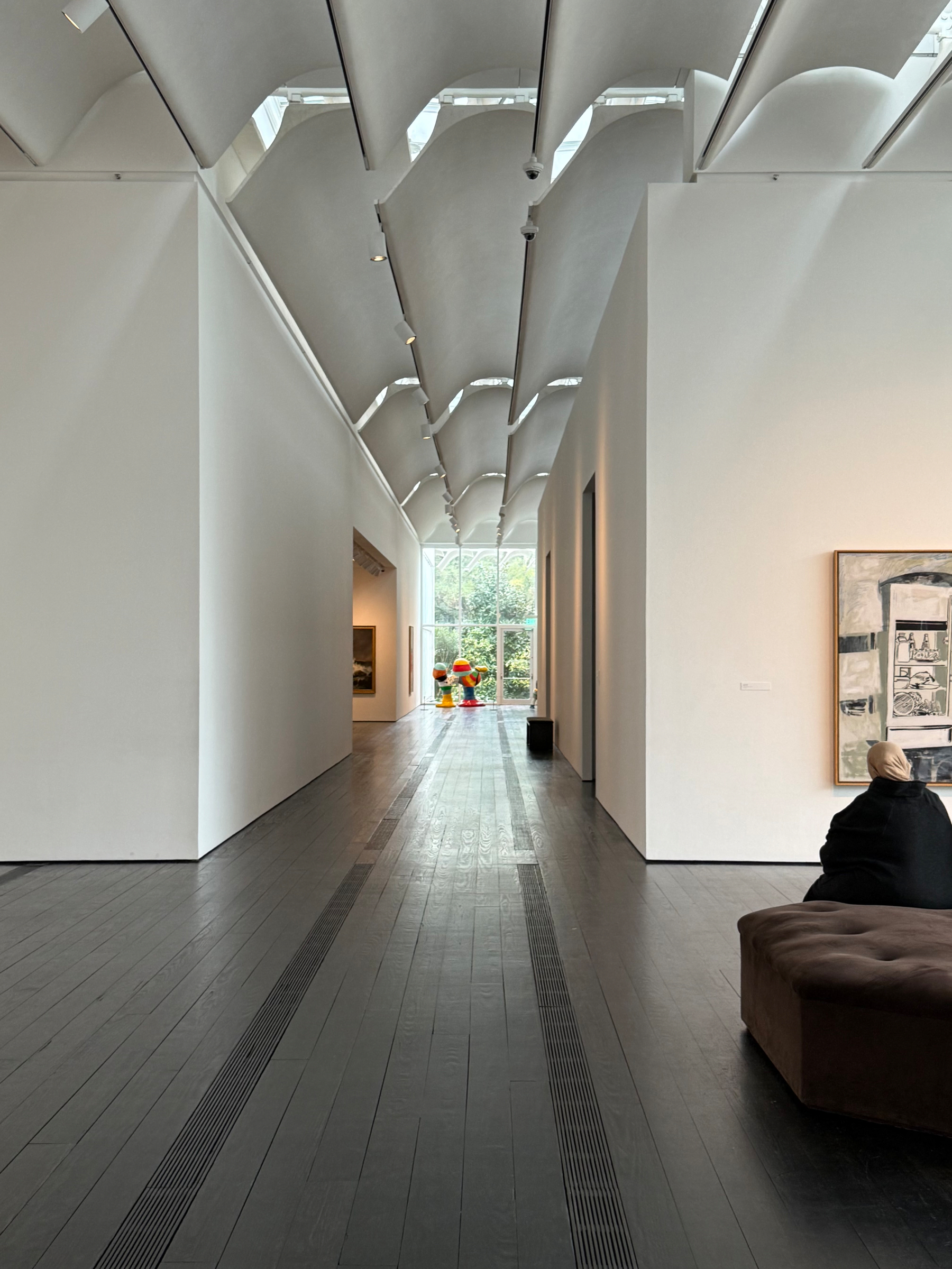
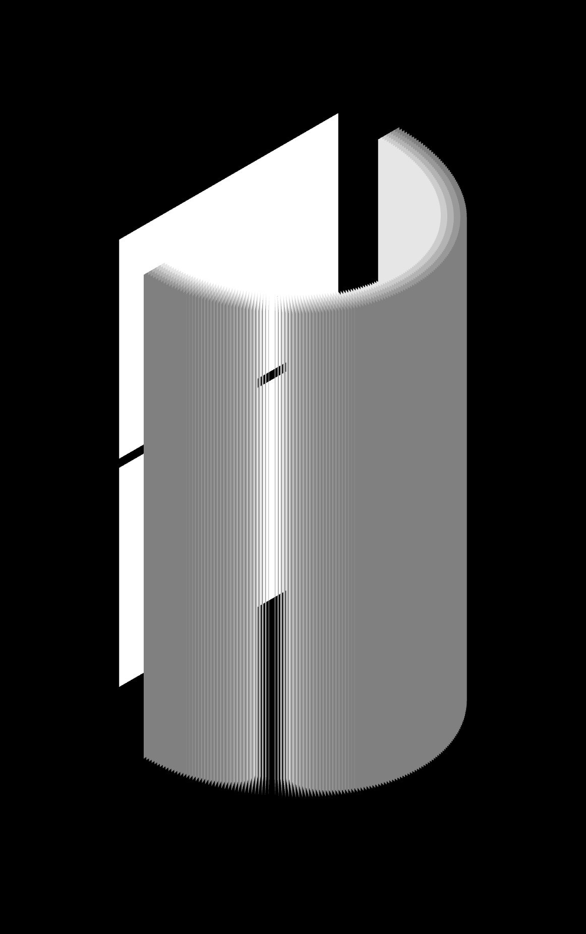

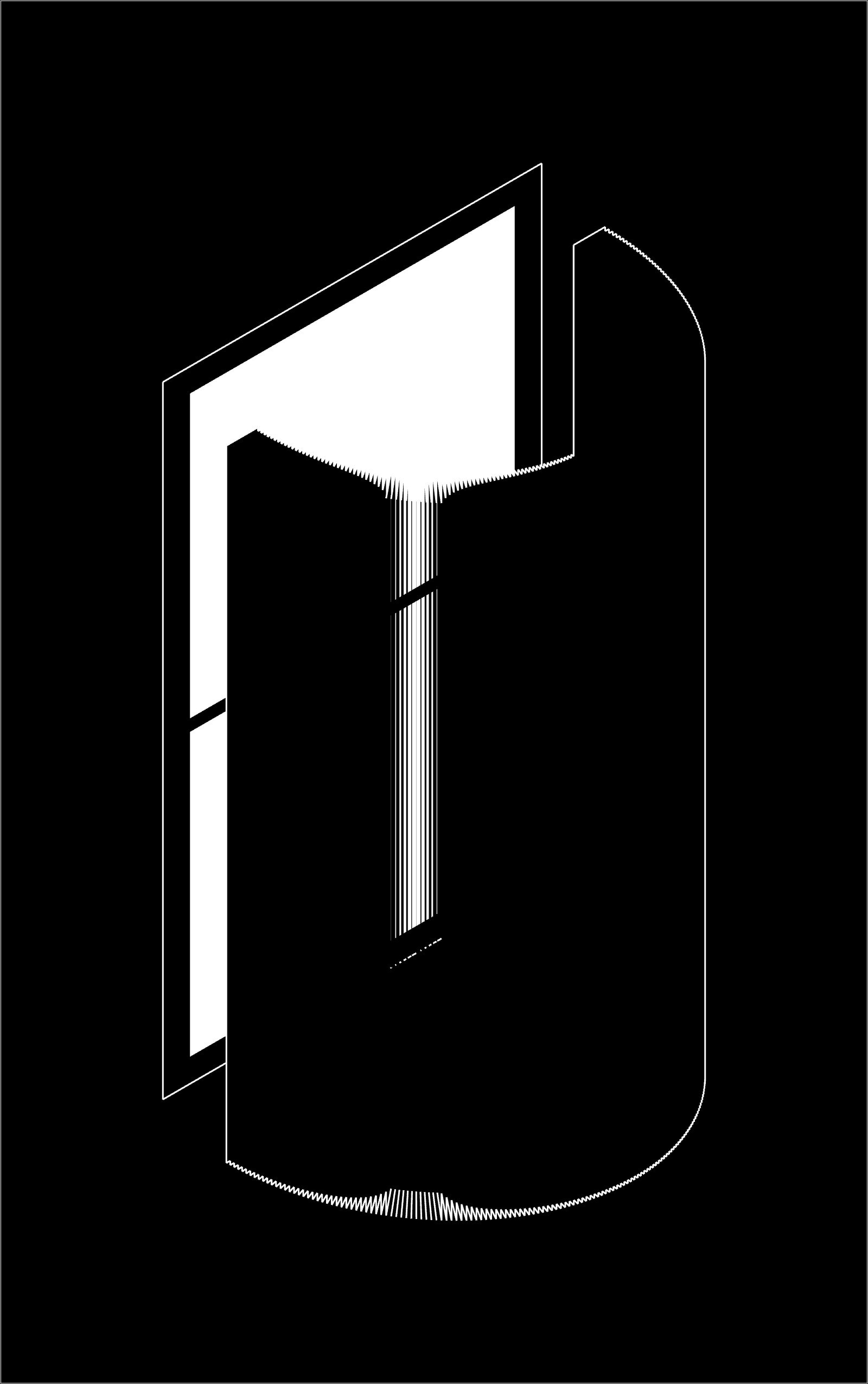
Diagram of two beams of light at different angles bouncing on a semi-reflective surface, and a drawing of a window behind a cylindrical fanning screen
Thinking about two quotes on color today. The first is from Toni Morrison’s Song of Solomon. The second is from Matisse. Both demonstrate ways of talking about color through taste, temperature, and touch.
“And talking about dark! You think dark is just one color, but it ain’t. There’re five or six kinds of black. Some silky, some woolly. Some just empty. Some like fingers. And it don’t stay still. It moves and changes from one kind of black to another. Saying something is pitch black is like saying something is green. What kind of green? Green like my bottles? Green like a grasshopper? Green like a cucumber, lettuce, or green like the sky is just before it breaks loose to storm? Well, night black is the same way. May as well be a rainbow.”
“To paint an autumn landscape I will not try to remember what colors suit this season, I will be inspired only by the sensation that the season gives me; the icy clearness of the sour blue sky will express the season just as well as the tonalities of the leaves. My sensation itself may vary, the autumn may be soft and warm like a protracted summer or quite cool with a cold sky and lemon yellow trees that give a chilly impression and announce winter.”
Sharing another interview today, with Hannah Wong. This is a slightly different version than was published on Architectural Writing Workshop a few years ago, as it follows my original edits.